USAA: AppX
Redesigning USAA's native app from the ground up — and rebuilding the design system behind it
Role: Senior Designer, AppX core redesign team — design through design lock
Team: 4 designers · partnered with Brand & Marketing, native engineering, compliance, and 3 product stakeholders
Timeline: 7 months, 14 sprints to design lock
Platforms: Native iOS + Android — banking, insurance, and investments for over 14 million members
Metrics: Full redesign of a 10-year-old app used by 14+M members · 150+ screens / 60+ components redesigned · design lock triggered a full refresh of the design system, UI kits, and guidance documentation
The Challenge
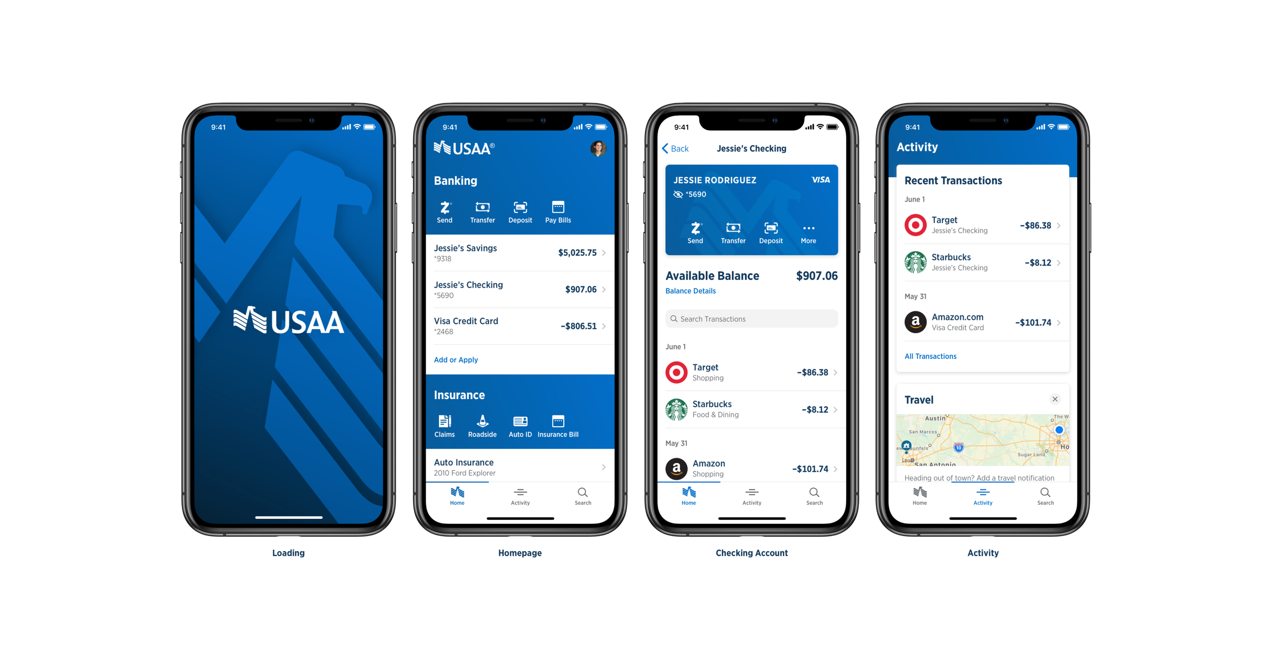
2020 marked the tenth anniversary of USAA's native mobile app — hence the project name, AppX. The app delivered best-in-class banking, insurance, and investment servicing, but our Native DLS research had surfaced an uncomfortable, validated finding: it looked like it was built ten years ago. Members' expectations were being set by the rest of their home screen, and we were losing that comparison.
The research created the mandate; executive stakeholders greenlit a complete ground-up redesign — UI/UX and code. (This is the cross-link: the DLS research page shows where this mandate came from.)
The constraints made it interesting. This wasn't a startup repainting an app — it was a regulated financial institution redesigning the primary channel for [X] million members, where every pattern had to survive usability testing andcompliance review. And there was a strategic design question underneath: how much should a USAA app feel like USAA versus feel like the platform? Early direction drifted toward a "skinned" iOS/Android app; I was part of the group of designers and development managers who made the case for — and negotiated the cost of — a defined level of custom design, so the app would be unmistakably USAA while still honoring platform conventions.
"The hardest design decision wasn't visual — it was negotiating exactly how much 'USAA' versus how much 'iOS' the app should be, with the engineering cost of every point on that spectrum on the table."
Architecture Decisions
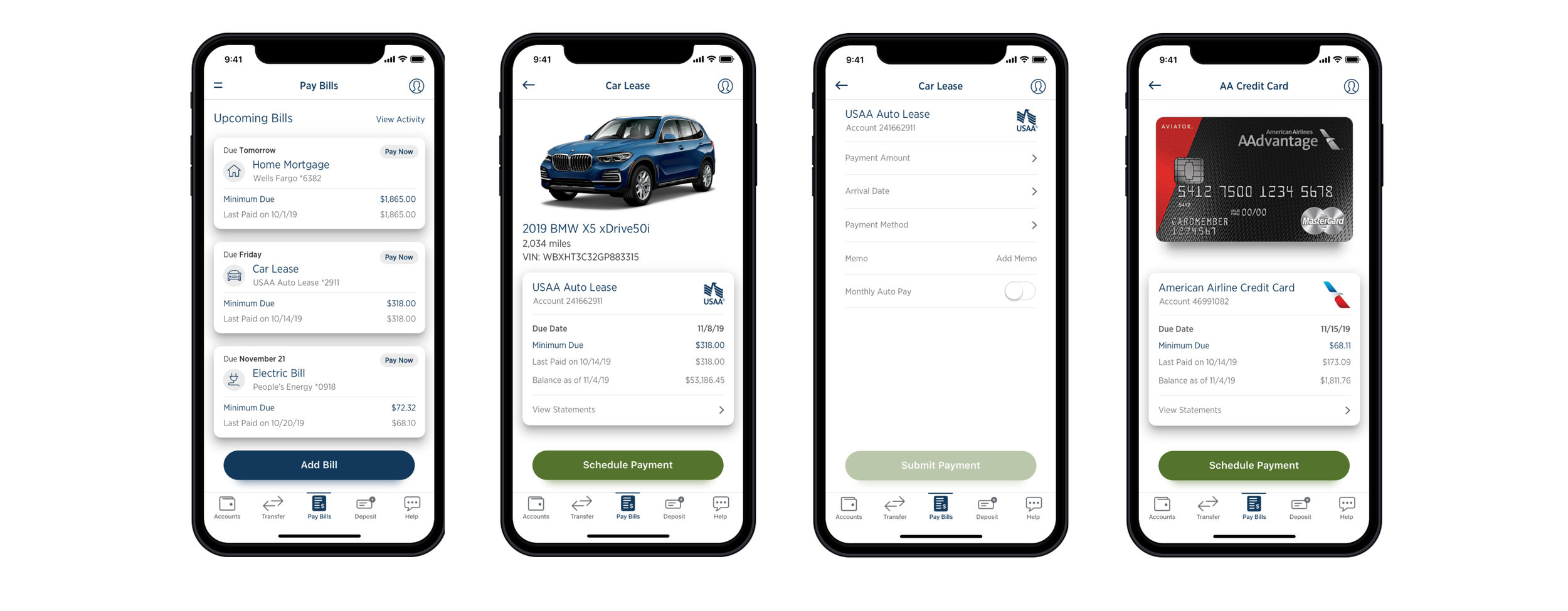
Inventory before invention. We began by cataloguing the existing UI component inventory and running qualitative comparisons against what was trending in the app stores — the same audit-first discipline I'd used on previous systems work. In parallel, we evaluated the new capabilities Apple and Google were shipping in their ecosystems, and let that assessment drive the new information architecture rather than retrofitting it later.
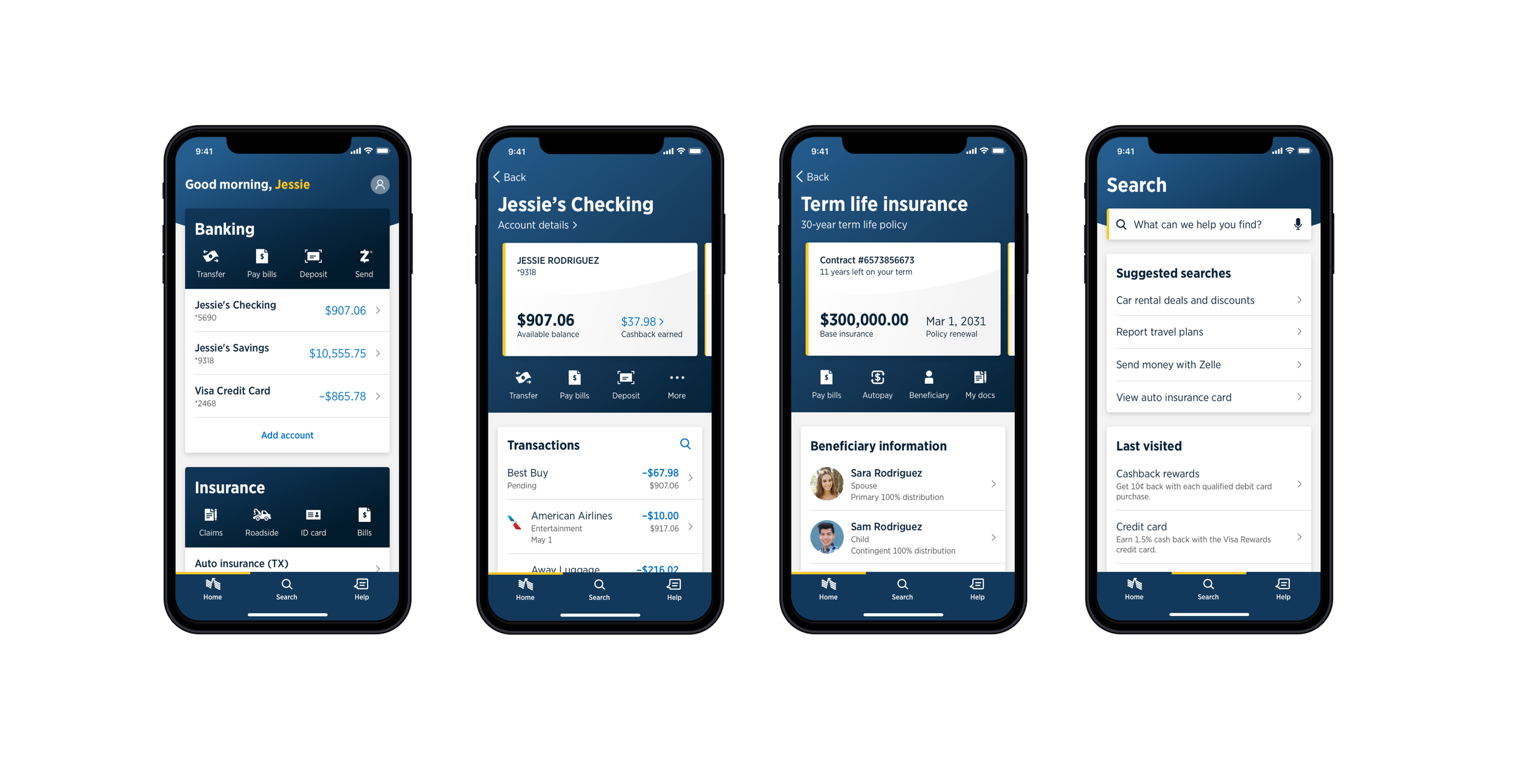
Design against the research, not the trend. The research described the existing app as "heavy" and "cluttered," with important information lost in the UI. My design response was structural, not decorative: group related information, create hierarchy through white space, and reduce each screen to its primary job.
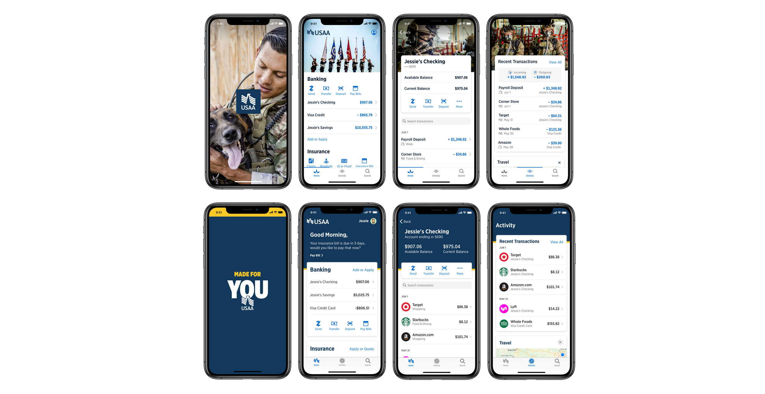
Brand refresh, integrated mid-flight. Midway through the redesign, USAA underwent a brand refresh. Rather than treating it as a disruption, I worked directly with Brand and Marketing to fold it into the design language — exploring directions that ranged from a stronger military-heritage theme to expressions of the new "Made for You" tagline. Landing a rebrand inside an in-flight redesign, without resetting the sprint clock, was one of the project's quiet wins.
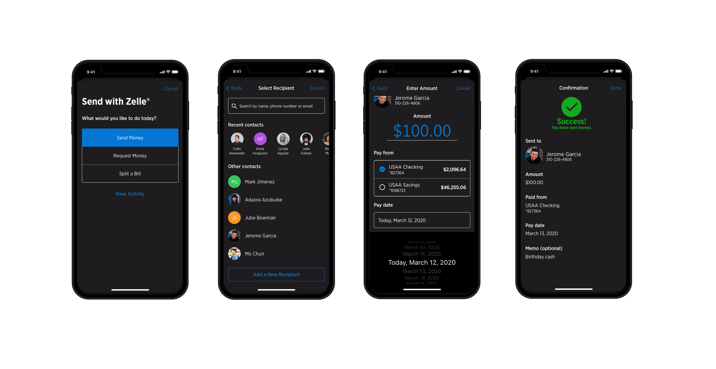
Dark mode, ahead of the curve. As part of evaluating new OS capabilities, I designed a full dark theme exploration at a time when almost no financial apps had shipped one. The exploration was deprioritized to protect the launch scope — the right call for the timeline — but the themes work established groundwork the system could pick up later.
Governance & Adoption
Design lock wasn't the finish line — it was the system's starting gun. After 7 months and 14 sprints of iteration, testing, and stakeholder reviews, design locked. That milestone immediately converted into systems work: redesigning and updating the design system, UI kits, and guidance documentation to reflect the new direction, so every team building on the app inherited the redesign instead of imitating it.
Testing as governance. Throughout the redesign we ran substantial internal and member-facing testing to identify pain points — design decisions had to earn their way into the lock through evidence, not preference.
Feasibility as a partnership. Post-lock, we collaborated with development teams to code, implement, and test the feasibility of every component — the design system was updated with what shipped, not what was drawn.
Compliance built in. Every pattern was designed within usability and regulatory requirements, so downstream teams consuming the updated kits inherited compliant defaults.
Review cadence. Decisions moved through a standing rhythm rather than ad-hoc escalation: weekly stakeholder syncs to review and demo in-progress designs, and bi-weekly checkpoints with the Chief Design Office for progress updates and directional alignment. Fourteen sprints of that cadence is what turned "countless iterations" into a design lock everyone had already agreed to.
Measured Outcomes
Shipped: AppX rolled out to 14+ million members beginning in March 2022.
Member response: App Store / Play Store rating moved from 4.1 to 4.8; based on approximately 2.3 million user ratings.
System refresh: 60+ components and 75 guidance documents updated to the new design language; UI kits v2.0 released to 50+ design teams.
Efficiency: teams building new features post-refresh reused ~70-80% of redesigned components / cut design-to-dev handoff by one third.
Design quality: member testing on redesigned core flows showed task completion up ~12 points (Pay Bills: ~82% → ~94%) and time-on-task down ~20%; "cluttered/heavy" — the top complaint in our original research — fell from a top-3 theme to a rare mention by the final testing rounds
Qualitative: the app finally looked like a USAA app — the custom design level we negotiated became the standing standard for native brand expression.
What I’d Do Now
Ship the system with the screens, not after them. We updated the design system after design lock. Today I'd evolve tokens and components as the redesign progressed — every locked screen immediately expressed as system updates — so implementation starts from the system on day one.
Protect one strategic bet. Dark mode was the right exploration cut for the wrong reason — scope pressure, not evidence. I'd now carry one forward-looking bet through launch with a defined smaller scope rather than cutting it entirely; being first matters in a category where every app looks the same.
Instrument the redesign. We tested qualitatively throughout, but I'd now baseline task-completion, satisfaction, and screen-level analytics before the redesign so the after-story is a chart, not a claim.
Name the decision framework. The "how custom vs. how platform" negotiation was resolved through judgment and persistence. Today I'd codify it as a written principle set with engineering cost tiers — a reusable governance artifact instead of a one-time agreement.