
USAA: Native Design Language System
Researching, defining, and standing up the design system for USAA's native mobile apps
Role: Founding member, Native Design Systems Team — led generative research and community strategy for the native DLS
Team: 3-designer founding team · partnered with 50+ design teams across all lines of business, native engineering, accessibility ops, and the Chief Design Office
Timeline: 6-month research and definition phase → 3 months to first kit/guidance release
Platforms: Native iOS (HIG) + Android (Material), serving USAA's banking, insurance, and investment apps used by over 14 million members
Metrics: 20-stakeholder research program (11 designers, 5 native developers, 4 business partners) · Sketch UI kits adopted by 50+ design teams · research directly triggered the AppX full-app redesign
The Challenge
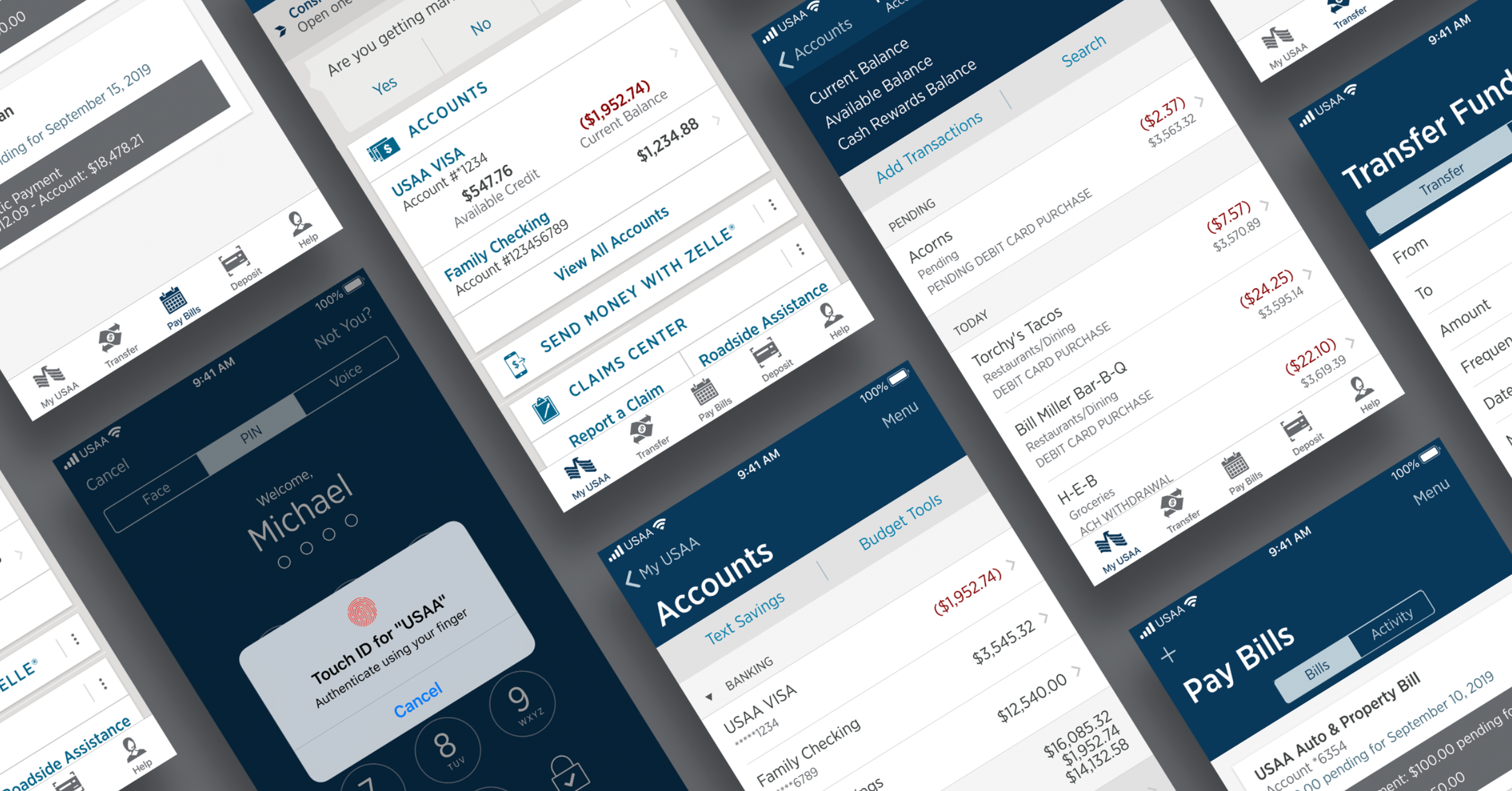
USAA's Chief Design Office had built an industry-leading Design Language System — for the web. The native apps were running on a thinner foundation: simple style guides and a handful of custom components, stretched across iOS and Android, maintained by no dedicated team. Meanwhile Apple and Google were evolving their platforms (HIG, Material Design) faster than a style guide could track.
Two other designers and I were hired to fix this — not by decreeing a system, but by building one the design community would actually adopt. USAA had 200+ designers across banking, insurance, and investments, each with their own deadlines and their own workarounds. A native DLS imposed from above would join the long list of ignored internal tools.
So we treated the design community as the system's first users, and ran discovery on them the way you'd run discovery on any product's users.
"A design system's users aren't members — they're the designers and developers who have to choose it every sprint. Without their adoption, there is no system."
Architecture Decisions
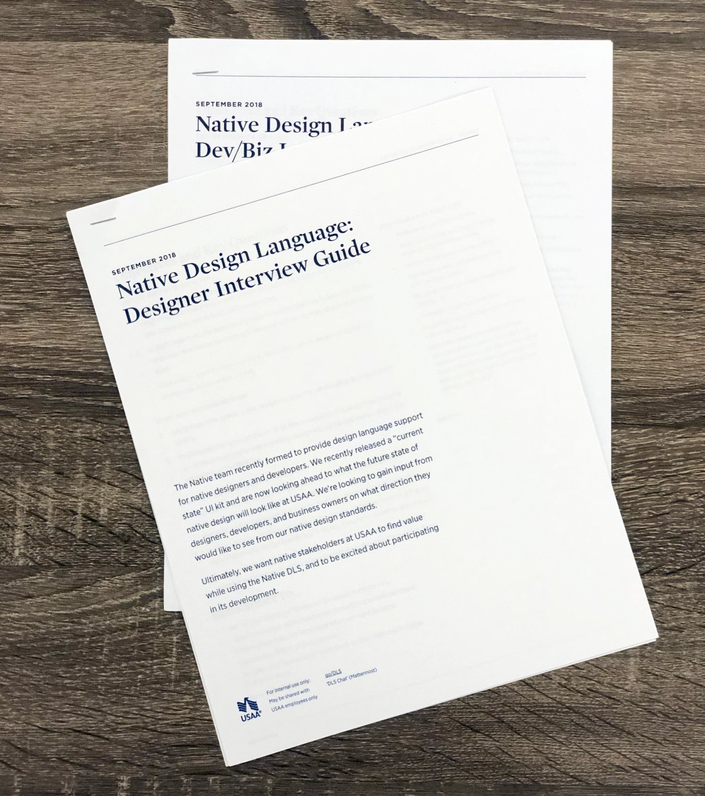
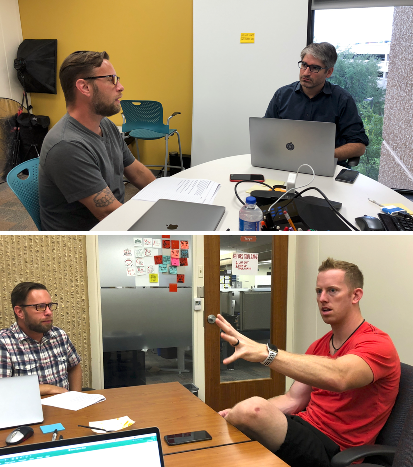
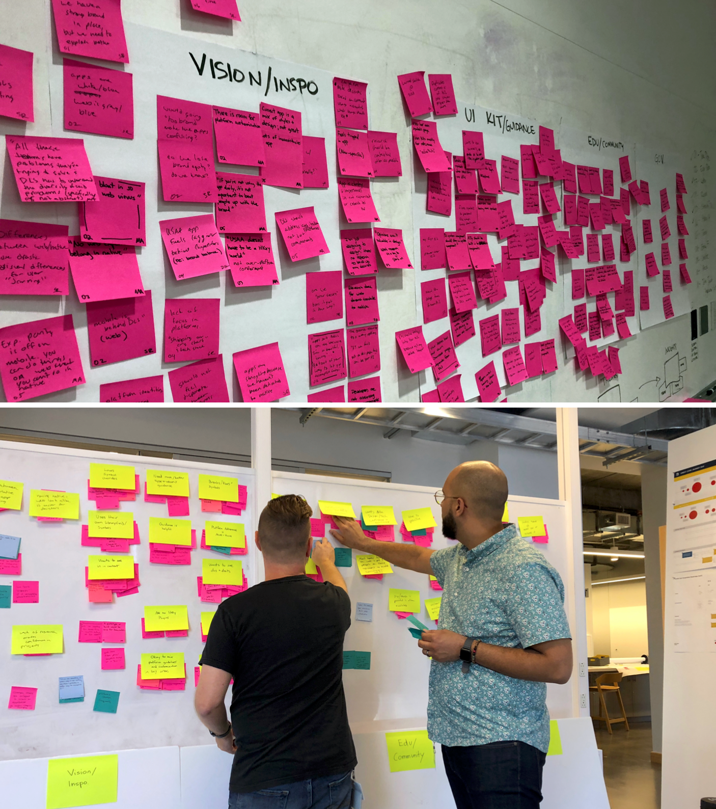
A research program with a project plan, not a vibe. I structured the community workshop as an 8-week program: methodology development (2 weeks), communication and recruiting (2 weeks), interviews (1 week), synthesis (2 weeks), and read-out design and delivery (1 week). Treating research like a shipped deliverable — with a timeline and an audience — is what kept it from becoming a deck nobody read.
Two hypotheses, explicitly framed. We organized every interview around two questions: Future state — what do design teams need from a native DLS, and how do they see native design at USAA evolving? Kit and guidance feedback — how are the existing Sketch UI kits and documentation actually used, organized, and understood when designers explain choices to stakeholders?
Cross-functional by design. The 20 participants weren't just designers: 11 designers spanning every line of business, 5 native developers, and 4 business partners. Including engineering and business voices in a design system's discovery was deliberate — the system would live or die in their workflows too.
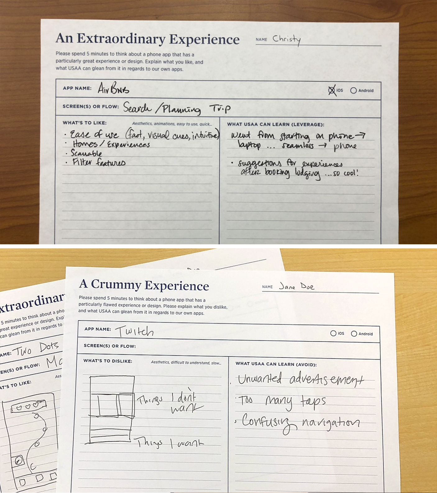
Grounding in real behavior. Each session included an app show-and-tell: participants opened an app on their own phone — exceptional or "crummy" — and unpacked what made it that way. This surfaced expectations members bring to USAA's apps from the rest of their home screen, not just internal opinions.
Synthesis to themes, themes to strategy. The interviews synthesized into clear directives: simplify the visuals, be consistent, adhere to platform conventions, find the right places to inject USAA's brand, and use member data to personalize. One finding was blunt — the app looked like it was built ten years ago.
Governance & Adoption
The read-out converted research into an operating model for the native DLS — the part that makes a system survivable rather than a one-time deliverable:
Embedded partnership over service desk. We hosted a DLS workshop with the Transfer Funds team and began integrating DLS designers directly into key projects, building components from real project scope instead of speculative backlogs. Components earned their place in the system by shipping in a product first.
Governance guidance. We created high-level guidance to help teams navigate Digital Governance — so the system carried compliance context with it, instead of every team re-litigating it.
Accessibility as a partner, not a checklist. We partnered with Accessibility operations to build compliant components at the system level, making accessible the default rather than a per-project audit finding.
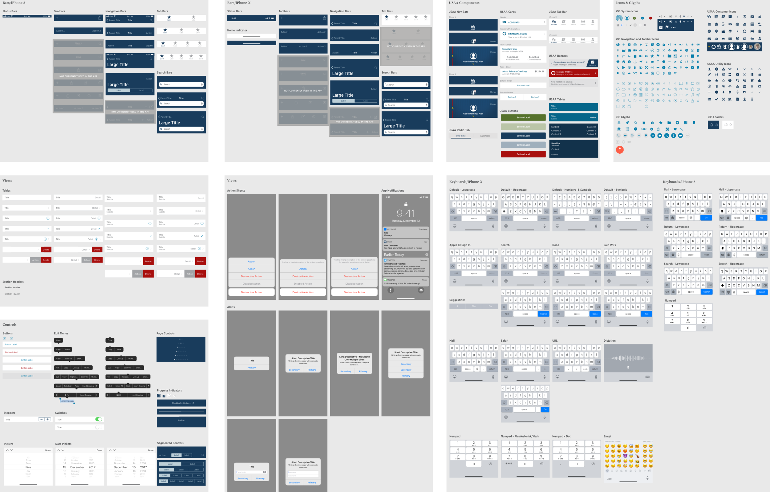
A path to code. We began strategizing a reusable code base tied to the component library — closing the gap between the Sketch kits designers used and what native engineers shipped.
The principle underneath all of it: a design system must become self-sufficient enough to withstand change — tech change, people change, and process change. Guidance and rules established early are what let the system outlive its founders.
Measured Outcomes
Direct product impact: the research finding that the app "appeared ten years old" was validated by stakeholders and became the catalyst for AppX — USAA's ground-up redesign of its native mobile app
Adoption: Sketch UI kits used by 50+ design teams within 3 months; kit v1.0 releases shipped per research feedback.
Coverage: 60+ components/patterns released in the first kit release, with accompanying guidance documentation.
Team growth: the 3-designer research effort grew into a native design systems team of 4, supporting 10-12 projects per quarter.
Reach: system decisions affected native experiences for over 14 million USAA members across banking, insurance, and investments.
Qualitative: design community shifted from inventing per-team workarounds to contributing requests through the DLS partnership model
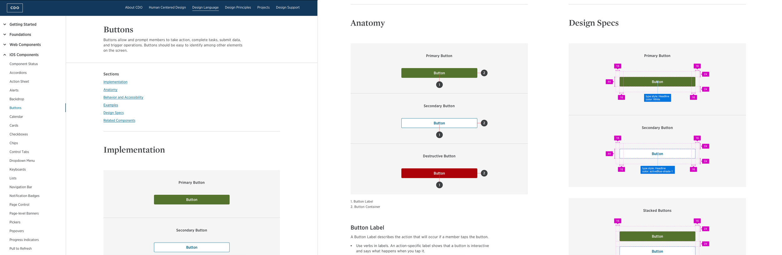
The guidance plays a critical role in maintaining the design system. The system needs to become self-sufficient to withstand change—tech change, people change and process change. Establishing the rules early on will help the system evolve through these changes.
What I’d Do Now
Compress discovery. Six months of generative research was thorough but slow for the appetite of the org. Today I'd run a 6-week discovery with the same rigor — fewer, sharper interviews and earlier prototype kits — and let the contribution loop refine from real usage sooner.
Tokens and code from day one. We researched design needs first and strategized code reuse last. Today I'd stand up the token pipeline and a coded component library (Figma variables → Storybook, iOS/Android token packages) in parallel with research, so design and engineering adopt one source of truth simultaneously.
Instrument adoption. We measured community sentiment; I'd now also measure behavior — kit insert/detach rates, component coverage per screen, contribution volume — and report them quarterly, the same way product teams report KPIs.
Formalize the contribution model earlier. Embedding DLS designers in projects worked, but it scaled linearly with our headcount. I'd add an explicit intake process and RFC path so teams can contribute without a DLS designer in the room.