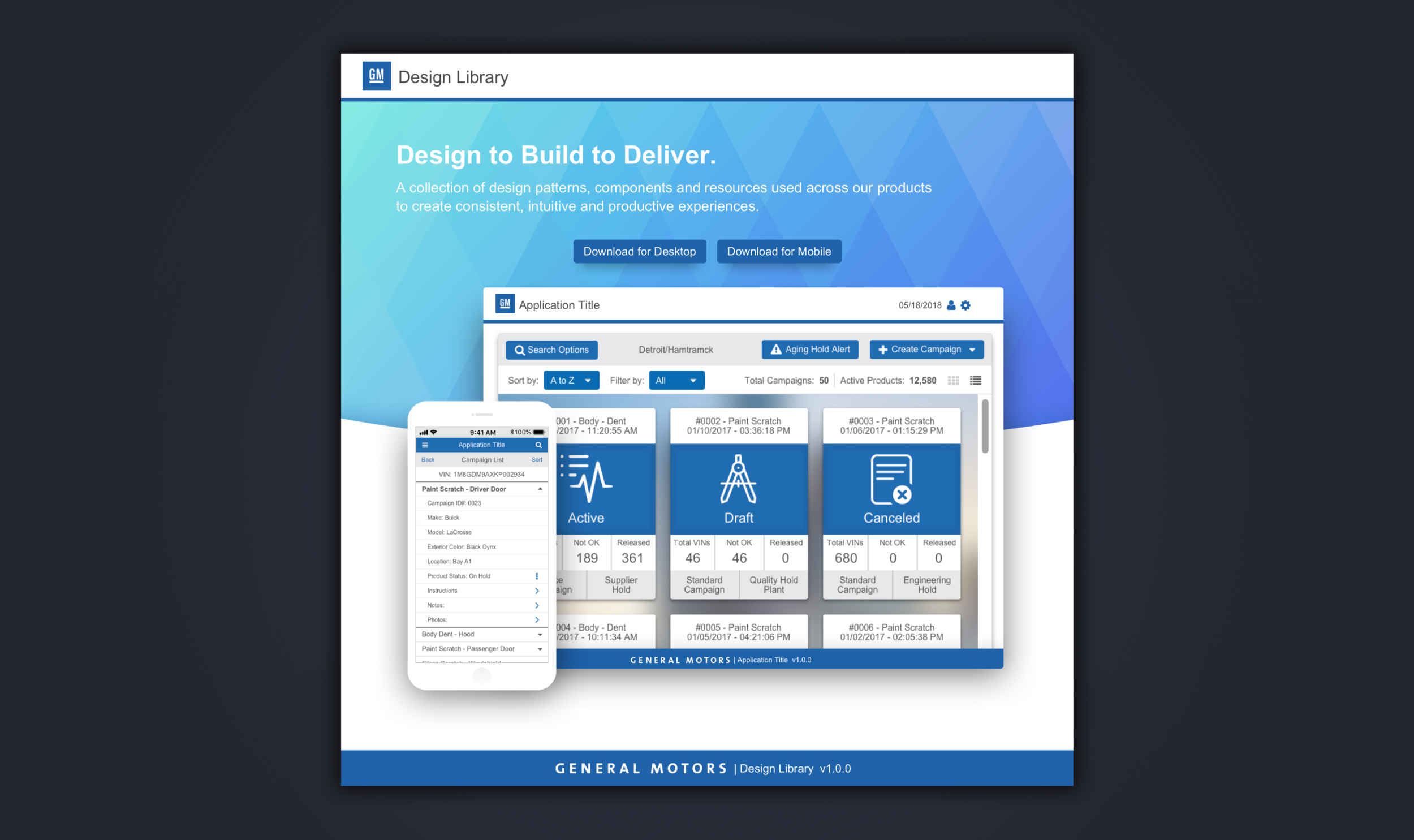
General Motors: Design Library
Built GM Manufacturing IT's first design system — from zero to org-wide adoption.
Role: Design System Lead (sole designer) — pitched, designed, and shipped the system end-to-end
Team: Partnered with 6 developers, 2 design teams, and Quality Management stakeholders across GM Manufacturing IT
Timeline: 6 months to v1.0 release
Platforms: Responsive web + mobile, 6 internal applications
Metrics: Adopted by 5 of 6 application teams within 2 months · UI delivery time reduced ~34% · 12 component categories, 18 sub-components, 100% documented with copy-able production markup
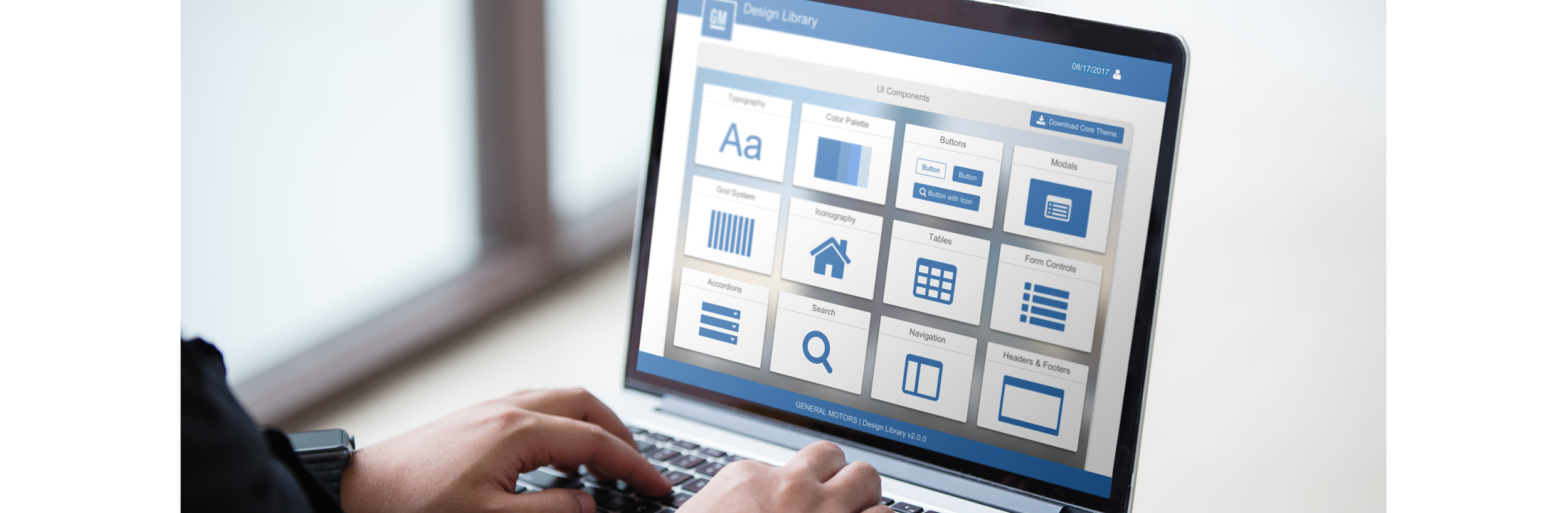
The Challenge
When I joined GM's Manufacturing IT (Quality Management) division, there was no design language — only a limited color palette and a few font sizes. Each of the division's 6 internal applications looked and behaved differently, and none of them looked like GM. Designers re-solved the same problems on every project, developers re-built the same components, and users re-learned basic patterns app to app.
Nobody asked me to fix this. I made the case that we should.
The real challenge wasn't design — it was buy-in. A design system meant asking business stakeholders to fund infrastructure with no immediate feature output. I built the argument in three moves: pitched the business problem (duplicated effort, inconsistent quality, brand erosion), presented benchmarks from successful systems at comparable enterprises, and built a working proof-of-concept — colors, typography, and a handful of components — so stakeholders could react to something real instead of a promise. We got the green light, timeline, and budget.
"Selling the system was harder than building it — and more important. A design system without executive sponsorship is a Sketch file."
Architecture Decisions
Audit first. I began with a full inventory of every UI element across our mobile and web applications. The audit surfaced 18 button variations, 5 distinct grays, and 4 competing form patterns. The audit doubled as my adoption tool: showing teams their own inconsistencies side-by-side did more persuading than any deck.
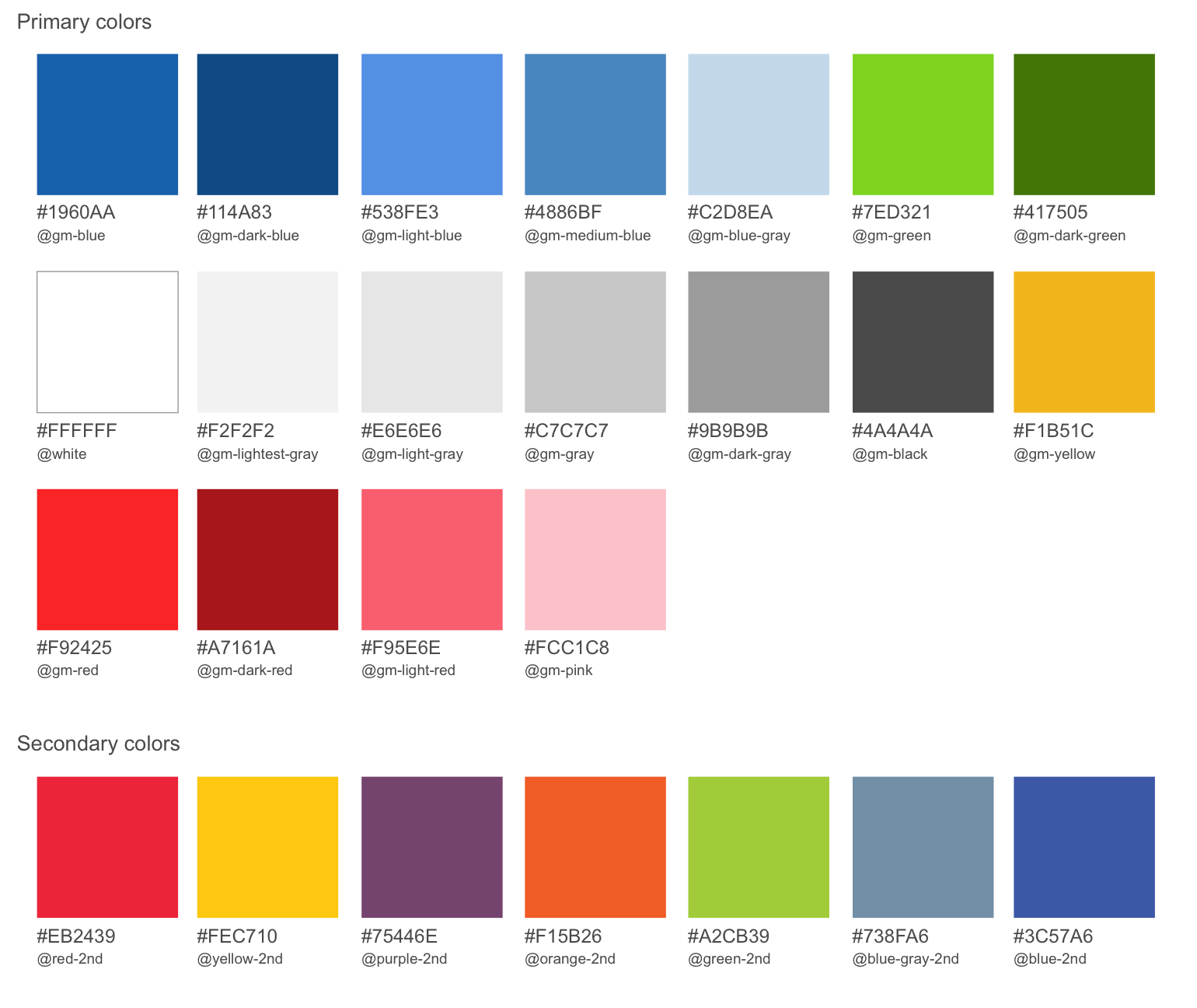
Color, built on accessibility. The palette was designed against WCAG contrast ratios from day one, not retrofitted — every primary/secondary pairing was validated for text and UI contrast. Tokens were named and namespaced (@gm-blue, @gm-dark-blue, @gm-lightest-gray) so designers and developers shared one vocabulary.
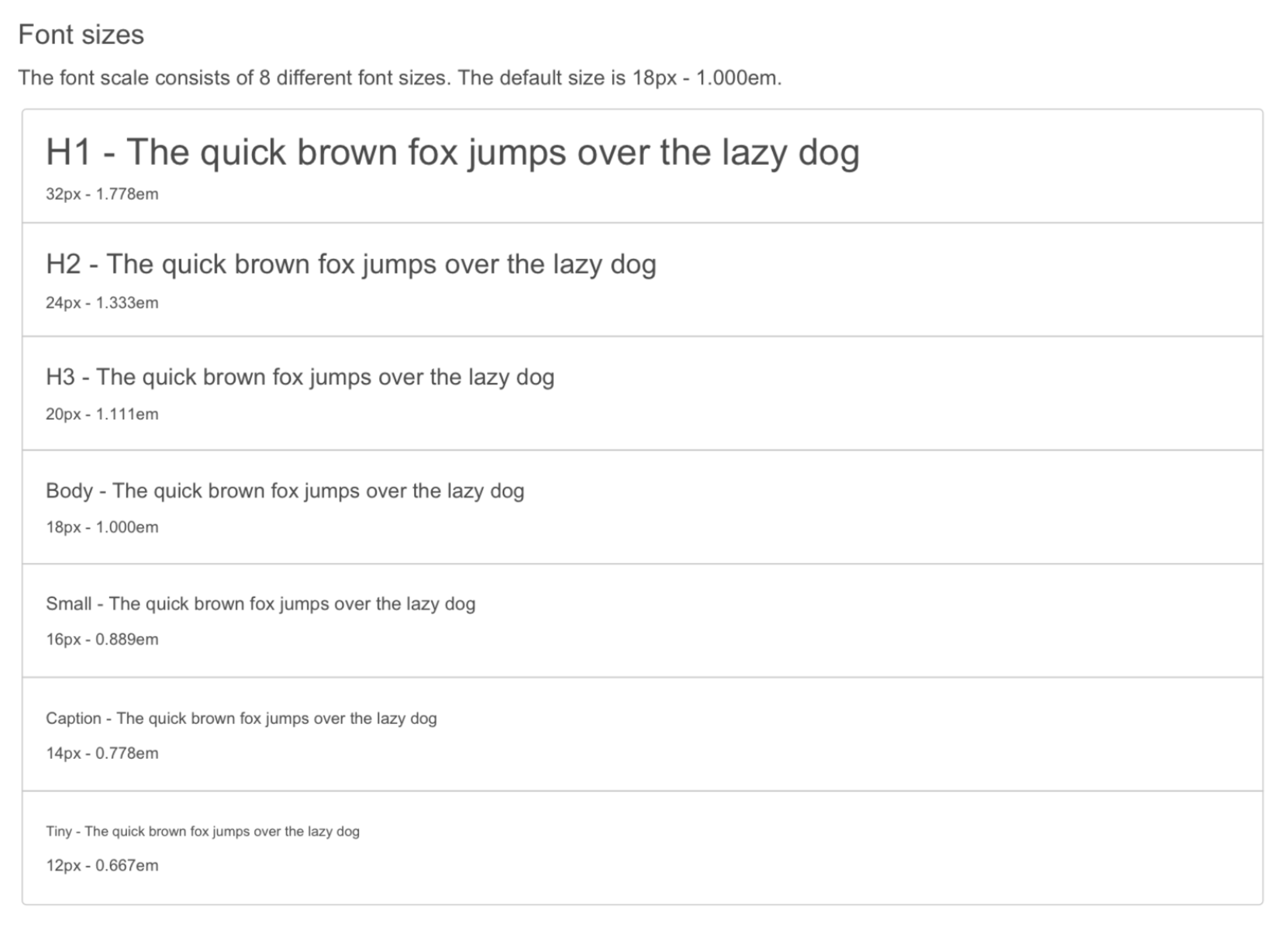
An 8-step typographic scale. Built on an em-based ratio (12px/0.667em → 32px/1.778em) and tested repeatedly to confirm it scaled across both web and mobile densities without per-platform overrides.
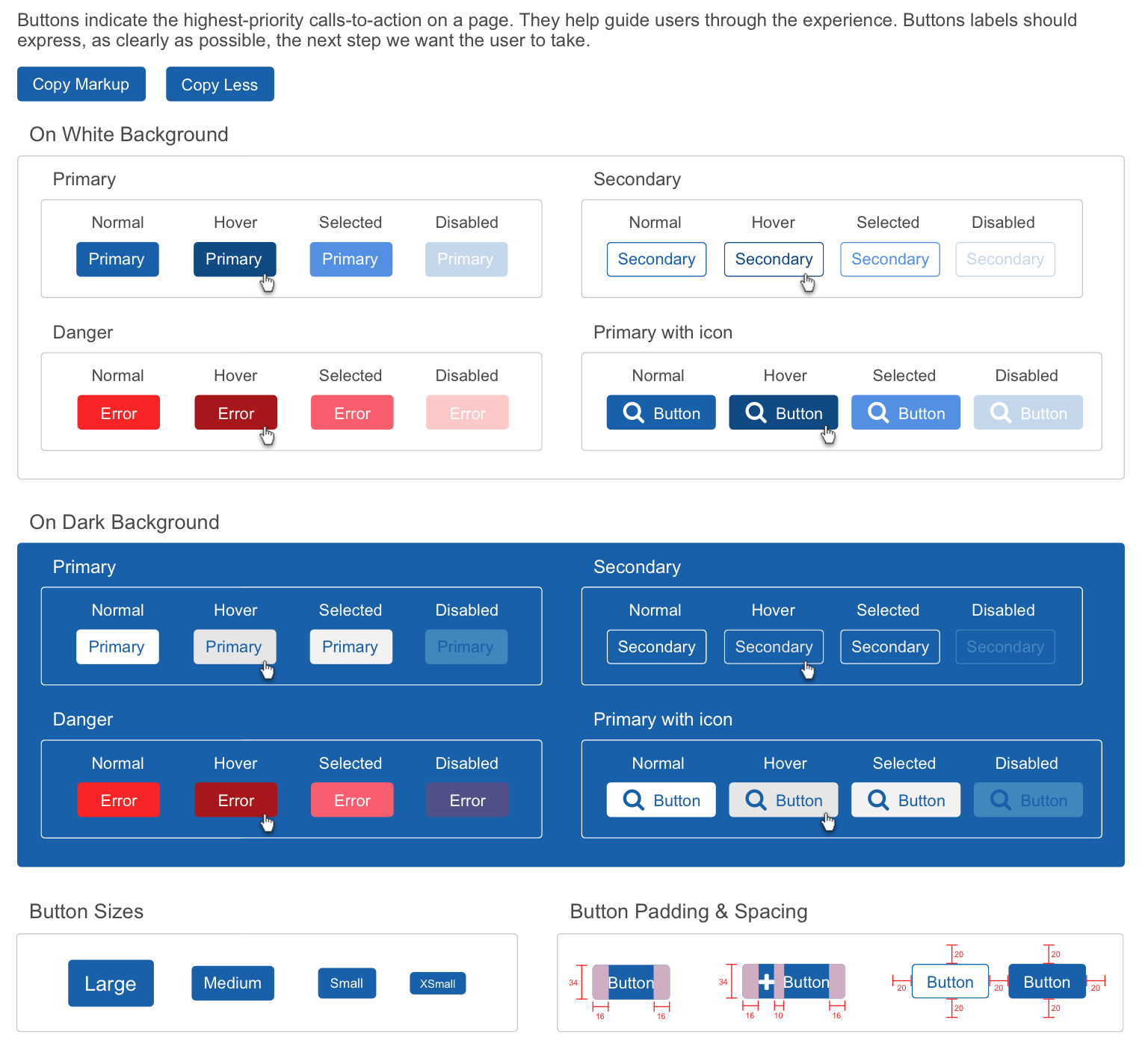
Components with states, not screenshots. Every component shipped with its full state matrix — normal, hover, selected, disabled — specified on both light and dark backgrounds, with padding and spacing redlines. 12 component categories, 18 sub-components, each with usage guidance ("Button labels should express, as clearly as possible, the next step we want the user to take").
Color Palette
Typography
Buttons
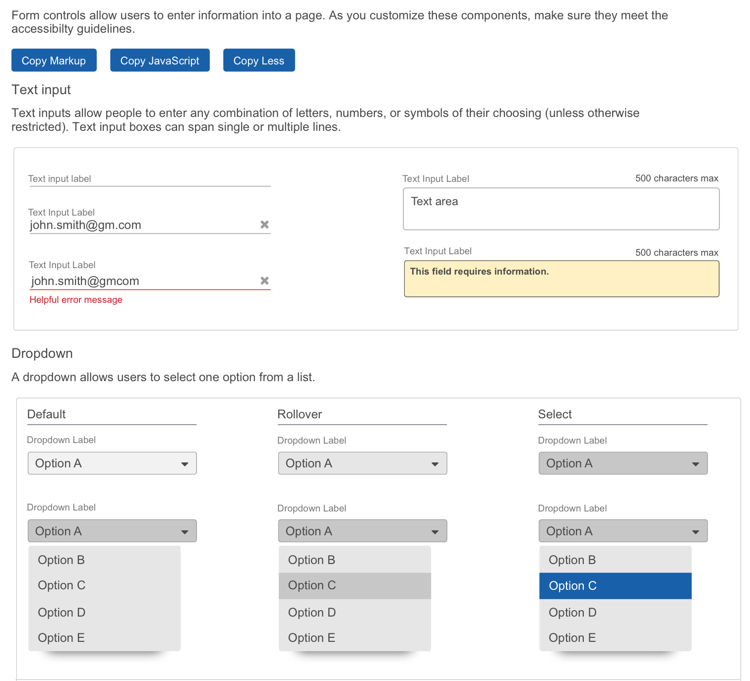
Form Controls
Governance & Adoption
A system nobody uses is shelf-ware, so I treated adoption as a product problem:
Documentation that served developers, not just designers. The library shipped as a living documentation site where every component included "Copy Markup" and "Copy JavaScript" actions — developers pulled production-ready code directly from the docs. This closed the design-to-code gap and made the system the path of least resistance: using it was faster than not using it.
Weekly critique as the contribution loop. The system evolved sprint over sprint through weekly critique and feedback sessions with the design teams consuming it. This kept the system community-owned rather than imposed — teams saw their feedback shipped, which compounded adoption.
A single source of truth. Centralizing components, patterns, and guidance ended debates about "which blue" and "whose button." Standardization reduced design-decision churn in cross-team communication.
“Before the system, a question as small as "which blue is our primary action color?" could burn most of a week — a designer would ask in a meeting, get three answers from three teams, escalate to a lead, and wait on a decision that someone else would quietly contradict a sprint later. After v1.0, that same question was a 30-second lookup: the answer was
@gm-blue, it was documented, and the developer could copy the markup on the same page. One team told me the fastest meeting they had that quarter was the one that didn't happen.”
Measured Outcomes
Adoption: 5 of 6 application teams consuming the system within 2 months of v1.0.
Velocity: Teams using the library delivered UI 34% faster / cut design-to-dev handoff from 7 to 2-3 days.
Consistency: 60% reduction in one-off components in new builds; audit re-run showed 18 button variants → 5.
Reach: System underpinned 5 applications serving 275 users across GM manufacturing operations — including the Visual Aid application deployed to all 11 GM assembly plants.
Qualitative: Fewer design-choice escalations, better cross-team communication, applications that finally looked like GM.
What I’d Do Now
Building this system today, I'd change four things:
Tiered token architecture. The v1 palette was a single layer of primitives. Today I'd structure primitive → semantic → component tokens with mode support (light/dark, density), so themes and rebrands become token swaps instead of redesigns.
Code as the source of truth. "Copy Markup" was ahead of its time, but I'd now pair the Figma library with a coded component library (Storybook + Code Connect), with tokens synced through a build pipeline rather than documentation.
A formal contribution model. Weekly critique worked at our scale, but I'd add an explicit intake process, RFC template, versioned releases, and a deprecation policy so the system survives team turnover.
Instrumentation from day one. My biggest miss was not baselining metrics before launch. Today I'd measure component adoption, detach rates, and delivery velocity from sprint zero — you can't prove the value you didn't measure.