
Perk - Scratch & Win!
Designing a shipped mobile game as a theming framework: one template, 15+ games
Role: Lead UI/UX Designer — concept through shipped product, including user testing and QA
Team: 1 designer, 2 developers
Timeline: 2 months to v1.0 release
Platforms: iOS + Android · Games category · free-to-play, rewarded-ads model
Metrics: Shipped to the App Store and Google Play · 15+ themed games built on one design framework · new theme shipped in ~10 days vs. 3 weeks for the original · 1M+ downloads (Google Play bracket: 1–5M)

The Challenge
Perk Scratch & Win! is a free iOS/Android game with a real economy: players scratch digital tickets to earn tokens and points, redeem them for actual prizes — Target gift cards, an Xbox, an HDTV — and the business earns it back through rewarded marketing ads. That model creates a three-way design problem most apps never face: the game has to be fun enough to retain players, generous-feeling enough that rewards seem reachable, and commercial enough that ads and app-install offers sit inside the loop without killing the fun.
It was my first mobile game, which forced the right question early: what makes someone keep playing a scratch game after the novelty dies? The answer we landed on shaped everything — variety on a schedule. Players don't stay for one great scratch ticket; they stay for a new one next week. Which meant the real design deliverable wasn't a game. It was a machine for making games.
"The deliverable wasn't a scratch game — it was a framework that could ship a new scratch game every week without redesigning anything."
Architecture Decisions
A theming framework, not a title. I designed the game as two strict layers. The system layer — persistent HUD (tokens, points, progress), the "find 3 of a kind" core mechanic, the prize box, win/lose states, and claim flows — was designed once and never varied. The theme layer — art direction, motifs, sound palette — was fully swappable: Football Frenzy, Beach Life, Vegas Cash, Pirate Treasure, Summer Scratch, 10 more. Players got endless novelty; the product got total consistency; the business got new content at skin cost instead of build cost.
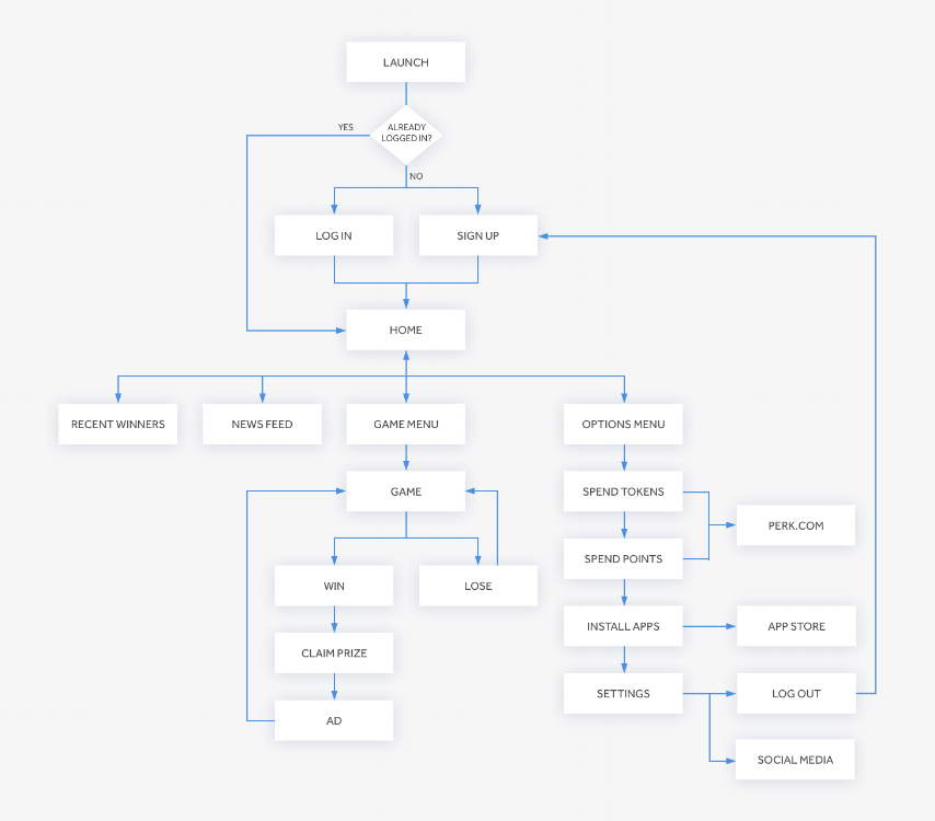
The economy was a user flow. Before visual design, I mapped the full loop as a flow diagram: launch → login/sign-up → home → game menu → play → win/lose → claim prize → ad → spend tokens/points → back to play, with exits to prize redemption, app-install offers, and settings. Designing the economy as a navigable system — where an ad is a step in the loop, not an interruption of it — is what let monetization coexist with fun.
Sketch-first, at every level. The icon went napkin sketch → initial designs → final through 5-6 iterations, and the game flows were resolved as paper wireframes before any theme art existed — cheap decisions made cheaply, expensive polish spent only on what survived.
Designing "loud" within a system. A casino-style game demands maximal visuals — color, glow, celebration. The framework is what kept maximalism from becoming chaos: exuberance lived in the theme layer while the system layer stayed disciplined underneath.
App Icon Design

An app icon must be visually distinctive enough to stand out in the App Store while remaining instantly recognizable on a user’s home screen. I began with rough sketches to explore a range of concepts, then developed the strongest directions digitally—refining typography, color, composition, and supporting graphic elements. The icon evolved through multiple rounds of iteration, with each variation helping clarify the concept and strengthen the final design.
Initial App Sketches

Sketching allows me to communicate ideas quickly, collaborate with others, and establish the foundation of the user experience early in the design process. These rough app concepts and user-flow explorations helped me evaluate structure, interactions, and key decisions without investing time in visual details. At this stage, the focus remained on how the experience should work—not on typography, color, or final interface styling.
Governance & Adoption
Template as contract. Every new theme inherited the HUD, mechanic, and prize patterns without renegotiation — I worked inside defined slots, which is why 15+ games shipped visually distinct but behaviorally identical.
Velocity by design. After the framework stabilized, a new themed game moved from concept to shippable in ~10 days — seasonal releases (Summer Scratch, Trick or Treat, St. Patrick's theme) were possible because the system absorbed the repeatable work.
Tested and QA'd as a product. User testing and QA were part of my scope — mechanics and reward flows were validated with players, not just shipped on instinct.
Measured Outcomes
Shipped to the App Store and Google Play as part of Perk's rewards ecosystem.
Framework leverage: 15+ themed games released on one design system; theme production time ~60-70% below building standalone.
Scale: 1M+ downloads (Google Play bracket: 1–5M) across Perk's app portfolio
What I’d Do Now
Name the framework in the deliverables. The theming system existed in practice but was never documented as a system — today I'd ship it as an explicit theme spec: slots, constraints, motion and sound guidelines, so any artist could build a compliant theme without me in the room.
Design the ethics deliberately. Rewarded loops and near-miss mechanics sit close to the edge of manipulative design. I'd now set explicit guardrails — transparent odds, spending friction, session nudges — as system rules, not afterthoughts.
Instrument the loop. I'd baseline per-theme engagement from launch and let data retire weak themes and steer new ones — the framework made themes cheap to ship; analytics would have made them cheap to learn from.
Prototype in motion sooner. A scratch game lives in its reveal moment — today I'd validate the core gesture and celebration timing in a motion prototype in week one, before any theme art.
Game Screens
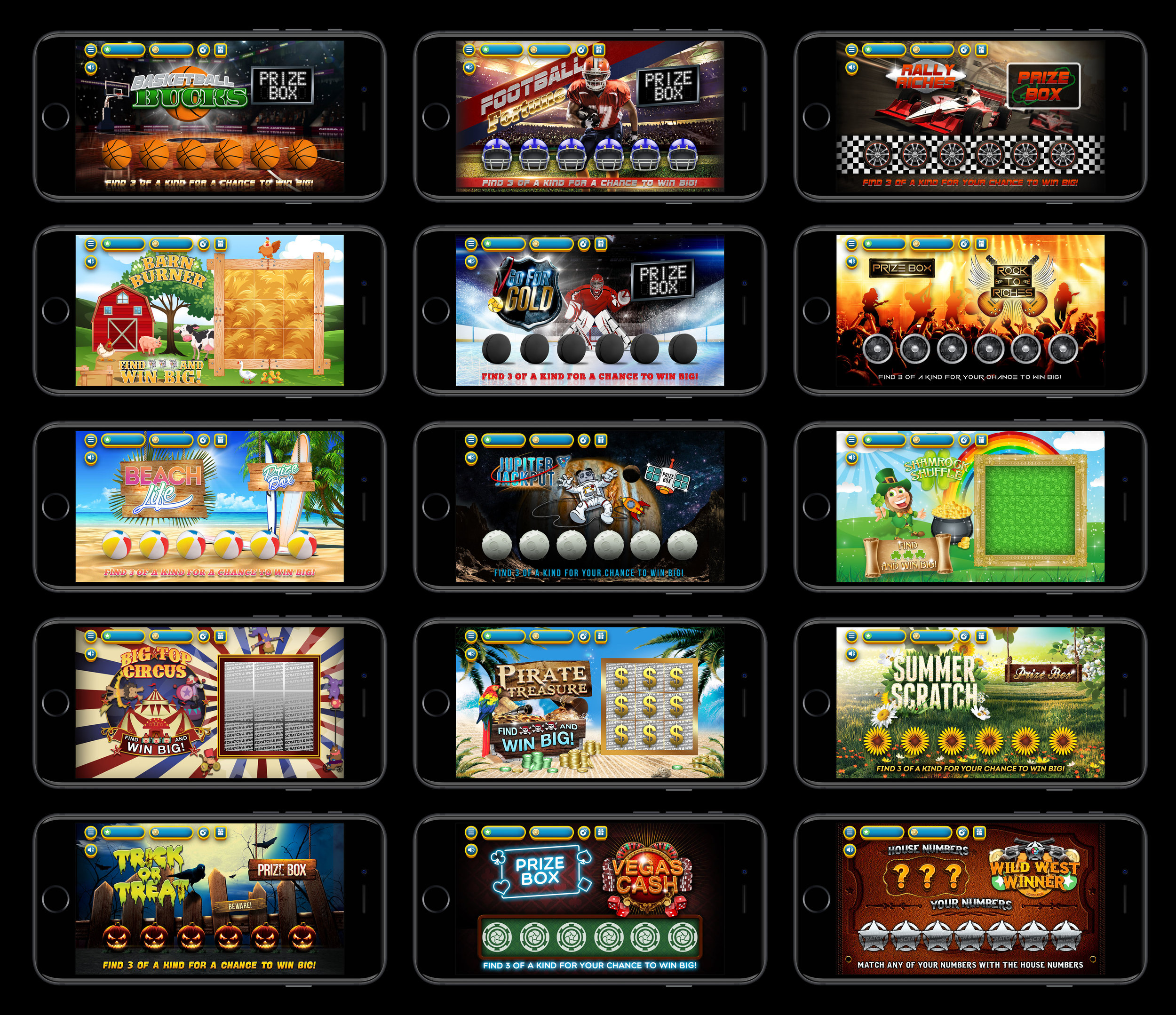
One framework, 15 themes — every game shares the same HUD, mechanic, and prize patterns. Only the theme layer changes.
Fun Facts

Top 5 in Casino Games (Top App Charts, July 24,2015)
Top 10 in Card Games (Top App Charts, July 27,2015)
Top 100 in Top Games (Top App Charts, July 23,2015)
Google Play Store Downloads = 1,000,000 - 5,000,000
“Very enjoyable game!
I actually won a gift card the first time I played!
This game can be pretty addictive!”