
Gone
Redesigning a startup's selling-as-a-service app — and building the style guide that got it there
Role: Lead UI/UX Designer — client engagement, wireframes through QA
Client: Gone — Austin, TX startup: sellers snap a photo, Gone handles pricing, logistics, warehousing, listing, and payment
Timeline: 7 months to v1.0 release
Platforms: Native mobile iOS + Android
Metrics: Full product redesign shipped on a brand style guide built from scratch — colors, type system, button states, icon set, and controls · redesign converged in 6 iteration cycles

The Challenge
Gone's pitch was radical simplicity: take a picture of the thing you want to sell, and Gone does everything else — pricing, pickup, warehousing, marketplace listing, payment. The business case was real (Nielsen put ~$3,100 of unused purchases in the average American household), but the design problem was trust: an app that says "just hand us your MacBook" has to feel effortless AND credible at the same time. Every screen had to earn the user's confidence that magic-simple didn't mean sketchy.
There was a second, structural problem. The client's existing UI predated the industry's shift from skeuomorphism to flat design — textured, heavy, and aging fast — and my early redesign screens, while a step forward, kept getting the same client feedback: more… or less, rather. We were iterating on taste instead of converging on a standard, because there was no brand style guide. Nothing to design against, nothing to say "done" against.
So I stopped redesigning screens and built the foundation first.
"We weren't disagreeing about screens — we were disagreeing about standards that didn't exist yet. So the real deliverable became the style guide; the redesign fell out of it."
App Icon Design
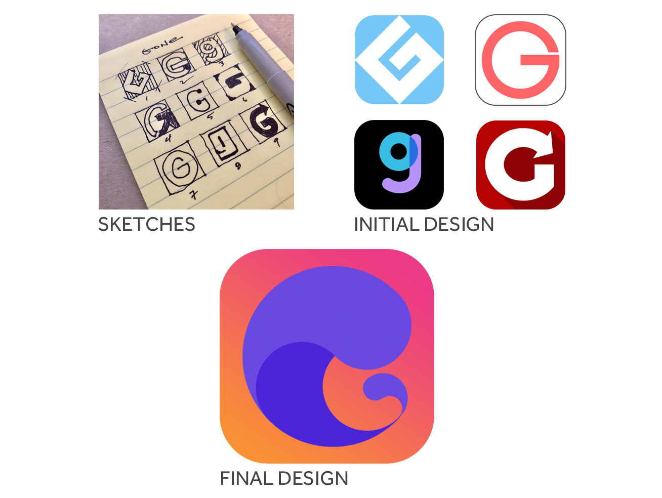
The app icon is often the most visible and frequently encountered expression of a product’s identity. My goal was to create an icon that felt distinctive, recognizable, and memorable while remaining aligned with the broader product experience. I began by sketching a range of concepts, translated the strongest directions into refined visual explorations, and used stakeholder feedback to guide each round of iteration. Through continuous refinement, the final design achieved the right balance of simplicity, personality, and brand recognition.
Early Mockup Screens

These early screens established a solid foundation, but client feedback revealed an opportunity to simplify the experience and create greater visual clarity. Because no brand guidelines existed at this stage, I also developed the foundational visual language—including typography, color, spacing, and interface styling—that ultimately informed the final design.
Brand Style Guide

Architecture Decisions
The style guide as the turning point. I created Gone's brand style guide from scratch: a color system with defined palettes and gradients, a two-typeface type system, Effra for brand, Roboto for UI with weight scales, button components in regular/hover/active states across all semantic colors, a 30+ icon set, form controls (switches, checkboxes, radios, sliders), and tooltip patterns. Once it existed, client conversations changed shape — from "I don't love this screen" to "this screen doesn't follow the system." Iteration cycles dropped from 8-9 rounds to 6.
Flat, but warm. The redesign embraced the platform shift to flat design the client wanted, but resisted sterile minimalism: the signature pink-to-orange gradient became the brand's emotional register — optimistic, light, nothing like a pawn shop. That gradient, systematized in the guide, is what made "simple" feel like a brand instead of an absence.
The core flow designed as a conversation. Selling on Gone had to feel like texting a capable friend, not filling out a listing form: tell us what it is → we're finding the best price → your earnings: $690 → sell it for me. Progressive, plain-language steps with one decision per screen — the UI equivalent of the company's one-photo promise.
Icon as brand compression. The mark went from pen sketches through 9+ directions to the final "G" — the gradient and the curl carrying the brand's lightness at app-store size.
User Flow Wireframes

Governance & Adoption
The guide as client contract. Deliverables were reviewed against the style guide rather than against taste, which protected the project from feedback drift — the startup version of the governance I'd later run at GM and USAA.
Built to outlive the engagement. The guide gave Gone's developers a standard to build against after my involvement ended — components and states specified, not just screens handed over.
Tested before shipped. User testing and QA were in scope; the conversational pricing flow was validated with users before release.
Measured Outcomes
Shipped: released on the App Store in 2016.
Convergence: post-guide, screens went from 8-9 revision rounds to 6 — the guide paid for itself inside the engagement.
Foundation: every subsequent Gone screen — 14+ screens across selling, pricing, tracking, and account flows — was assembled from guide components.
What I’d Do Now
Start with the guide, not arrive at it. The style guide rescued the project mid-flight; today it's my day-one move with any client whose product lacks one — cheaper to build before opinions harden.
Ship it as a living kit. The guide was a document; today it'd be a Figma library with variables and component states the client's team could consume directly — the difference between handing over rules and handing over tools.
Design trust explicitly. "Give us your MacBook" needed trust affordances I'd now treat as first-class: transparent pricing rationale, item status visibility, and social proof designed into the flow rather than implied by polish.
Define the motion language. A brand this light lives or dies in its transitions; I'd spec the motion system (easing, duration, the gradient's behavior) in the guide itself rather than leaving it to implementation.
