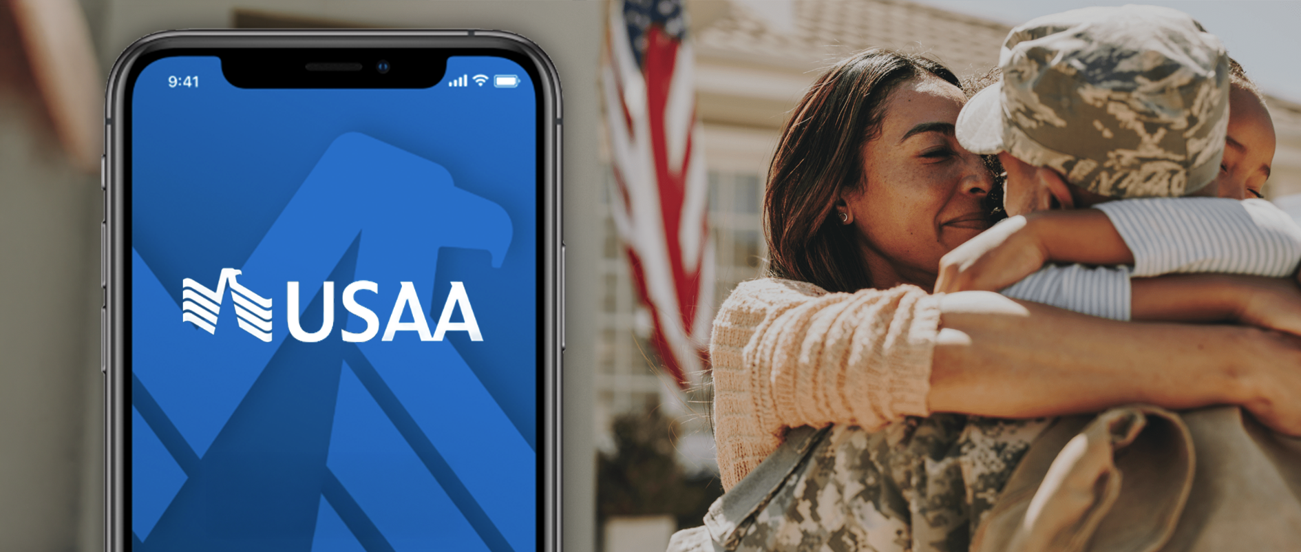
USAA: AppX
MY ROLE: SENIOR DESIGNER
My responsibilities for this project included user flow design,
visual design, interaction design, and prototyping.
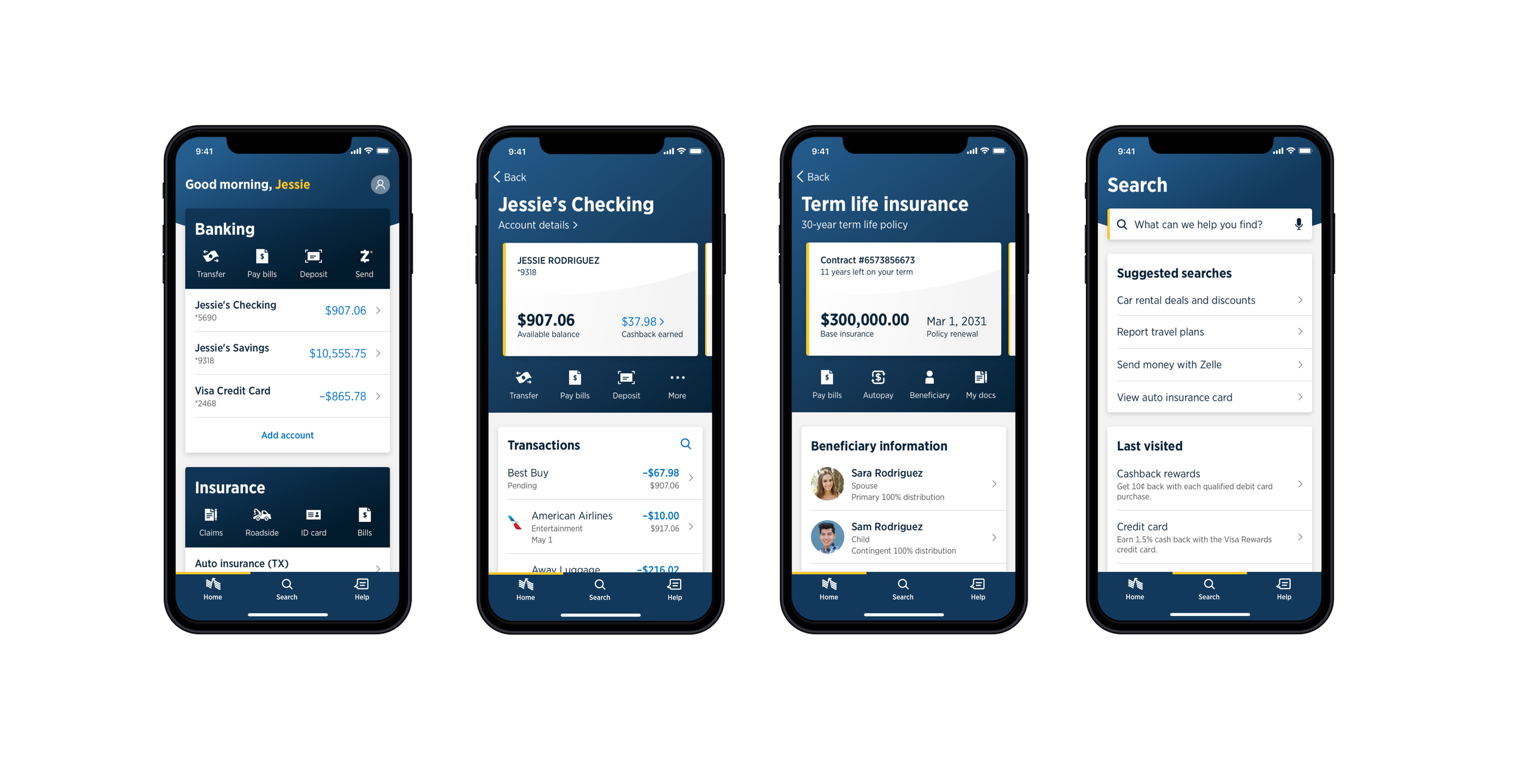
2020 celebrates the 10th anniversary of the USAA native mobile application, hence the name AppX. After providing our members a best-in-class banking, insurance, and investments experience, we (er, top executives) decided it was time for a complete re-design from the ground up, including UI/UX design as well as code development.
This idea was already sparked by stakeholders wanting more from the work we concluded on the Native Design Language System. One of the insights from the research we conducted early in the system creation, was that our app looked like it was built 10 years ago and appeared to be dated. Well, it was, and it was nice to get some validation on this finding.
The task was not only to update the look and feel, but to bring USAA’s mobile application up to speed with certain design trends while maintaining usability and compliance requirements. During this time, there was substantial amount of testing, both internal and member facing to recognize users’ pain points and eliminate confusion.
We began to inventory our UI components and do some qualitative comparison to what is trending in the app stores. We also evaluated the new technologies Apple and Google have brought into their OS ecosystems to determine the direction of the information architecture in our new app.
It was also decided, later, that the application needed to look more like a USAA app, rather than a USAA “skinned” iOS or Android app. So the deciding parties, mostly stakeholders and development managers, agreed on a certain amount of customization that would be needed to achieve this design direction.
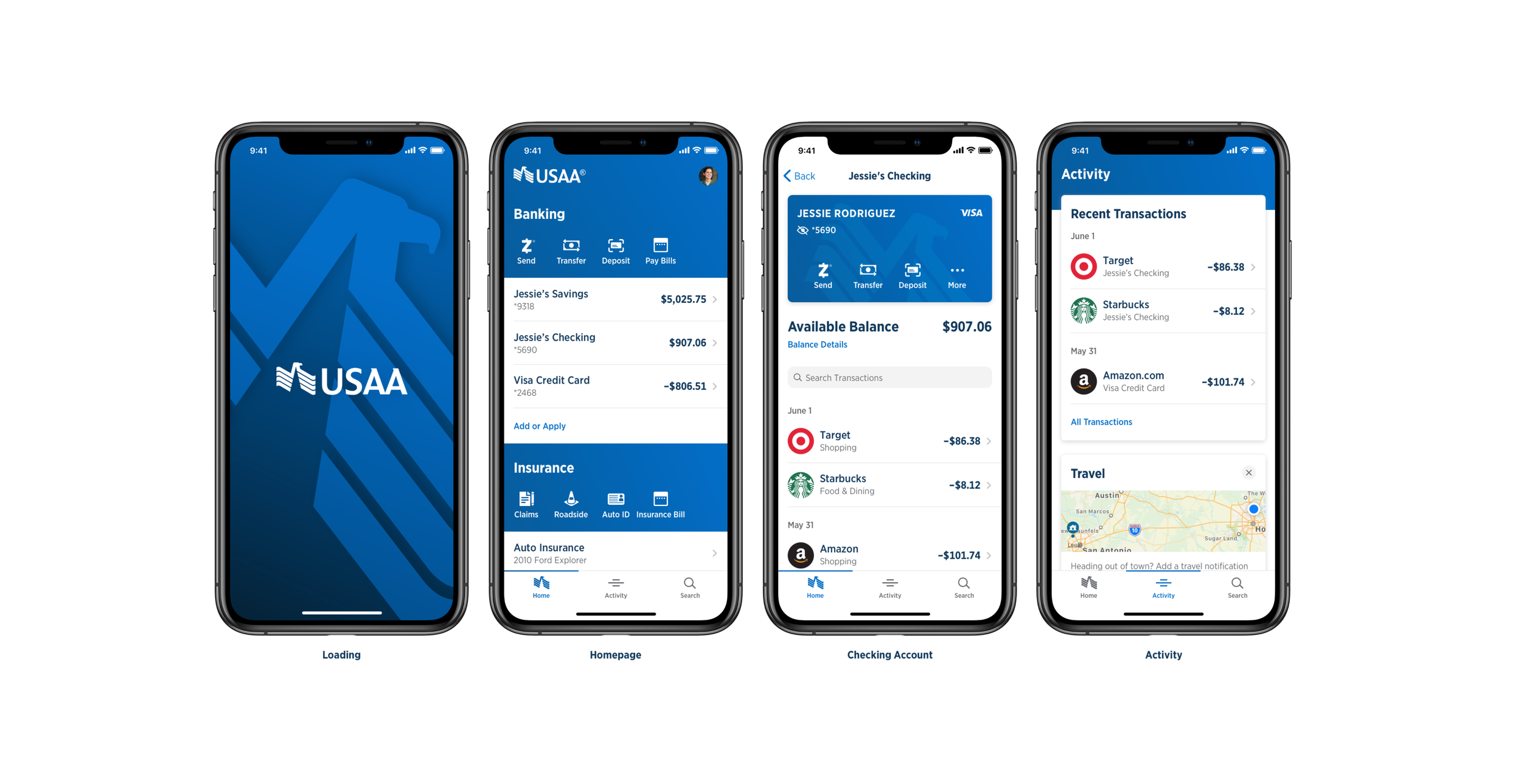
Initial Exploration

Some of the insights from the research read that the current app was “heavy” and “cluttered”. Important information was getting lost in the UI. I tried to minimize this by creating simple designs that grouped information and used white space to “open up” the app UI. Although these initial designs pleased some partners, there was still A LOT of work to do.
Brand Refresh
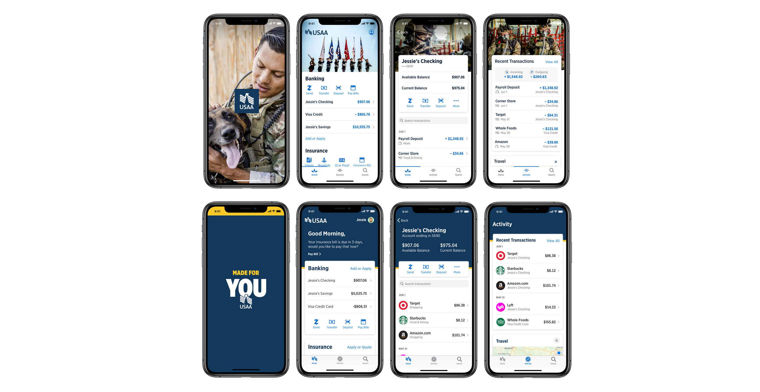
In the midst of all of the app re-design, USAA also went through a brand re-fresh. Fun stuff. It really was. Collaborating with Brand and Marketing teams to help shape the design of this new app brought out some great ideas to explore. As you can see above, I explored a more military theme as well as incorporated our new slogan/tag line, “Made for You”.
Dark Mode?
As I previously mentioned above, we wanted to explore the new technologies Apple and Google were developing in their OS. Dark mode was one of them. I found it very interesting in playing around with light and dark themes, though while I was exploring these designs, I failed to find market comparisons that designed a dark mode for their app. Weird. I was disappointed when the exploration was scrapped. Maybe in the not-so-far-off future USAA will live in dark mode.
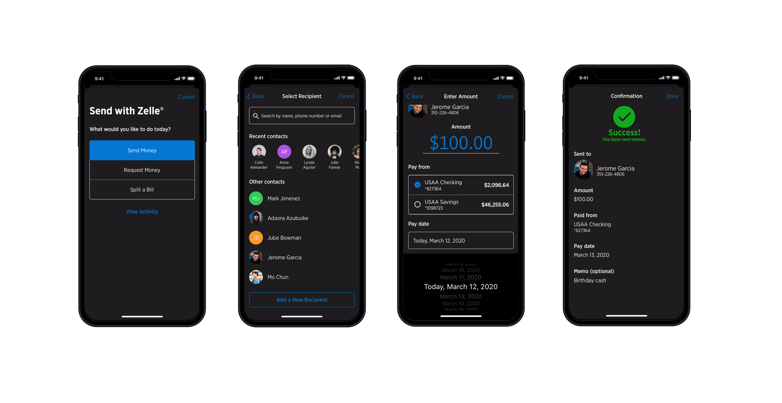
We have a Design “lock”!
Finally. After 7 months, 14 sprints, and countless iterations and reviews, design is “locked” and we can start re-designing and updating our current design system, UI kits, and guidance documentation to reflect the new design direction. It doesn’t stop there though, we still have a ton of work collaborating with development teams to code, implement, and test the feasibility of the components.