
General Motors: Design Library
MY ROLE: SENIOR UI/UX DESIGNER
My responsibilities for this project included concept development, wire-frame & user flow design,
visual design, interaction design, prototyping, user testing, and quality assurance.

When I was hired at General Motors in the Manufacturing IT (Quality Management) division, only basic style guidelines existed, consisting of a limited color palette and few font sizes. There was no design language and each application looked like the wild west, each different than the next. More importantly, they didn’t look like GM applications. Having seen and worked this way, I soon realized that I needed to design and implement a new design library, specifically, a system, of reusable UI components, patterns, and documentation so that design and development teams could benefit from an established set of design principles and standards.
The challenge was to convince and persuade business stakeholders to buy-in and approve the timeline and budget required to build a design system. It was no easy task, but through pitching the idea, presenting examples of successful design systems, and building a proof-of-concept that contained colors, typography, and few components, we got the green light and to create our first design system.
I started by creating a catalogue of all the UI elements we were using in our applications on both mobile and web. This inventory revealed some inconsistencies in our designs, but paved the way for improvements moving forward. This also helped in getting other design teams on board by showing how these inconsistencies adversely affected the user experience. This experience is not only important to the overall customer satisfaction, but to the usability of the product as well.
Color Palette
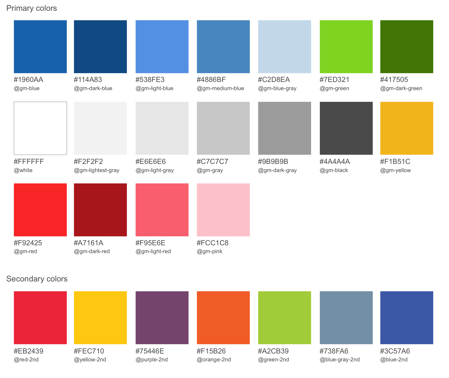
Next, I worked on the color palette. Knowing that it impacts all areas of a design system, I referenced WCAG (Web Content Accessibility Guidelines) to ensure that I was meeting color contrast ratios to provide an accessible application for all users.
Typography
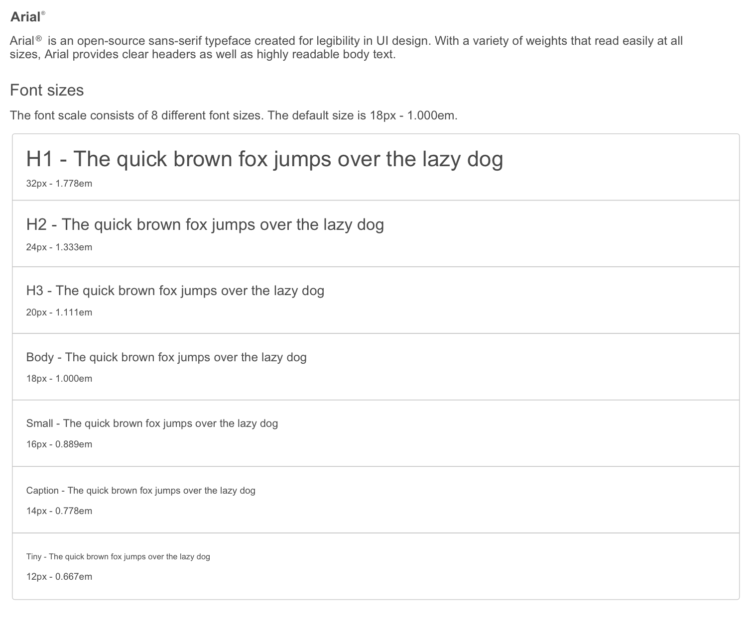
The typographic scale came soon after. Working with 8 scales, I tested and re-tested to make certain that the typography could scale across both web and mobile platforms.
Buttons

Form Controls
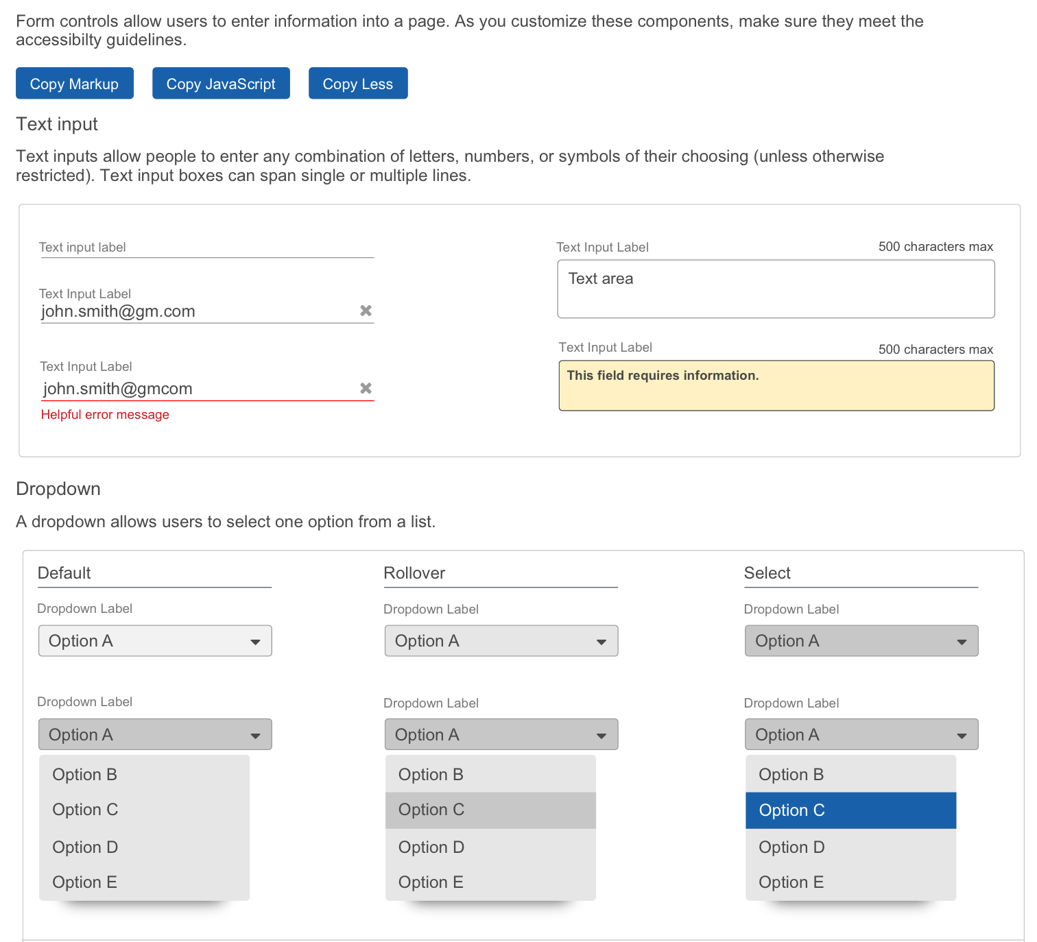
As I built this single source of truth, sprint after sprint, the UI components and patterns continued to evolve. After each iteration, the design system became more defined and polished by making necessary improvements through weekly critique and feedback from the design teams.
Finally, after 6 months of designing and building 12 different component categories and 18 sub-components, all with accompanying documentation, our first design system was released to designers. Soon after release, teams that were adopting this new tool for design started to deliver applications faster and the quality consistency of the UI and UX was greater throughout. This new system led to overall better internal communication by minimizing confusion of design choices. By being standardized, it kept everyone on the same page.
