
Scaling Accessibility with Dynamic Type
How I evolved our Design System to support adaptable, readable, and resilient iOS experiences at every text size
Role: Design System Specialist — sole designer, owned strategy through specification and engineering partnership
Team: 1 designer (me) + 2 iOS engineers, in close collaboration with Research
Timeline: 5 months · 2025-2026 · part of ongoing design system platform work
Platform: Native iOS
Metrics: Shipped Dynamic Type support across the system’s typography and highest-use components · 22 components moved to adaptive behavior · zero accessibility-specific component variants required — one system, not two
The Challenge
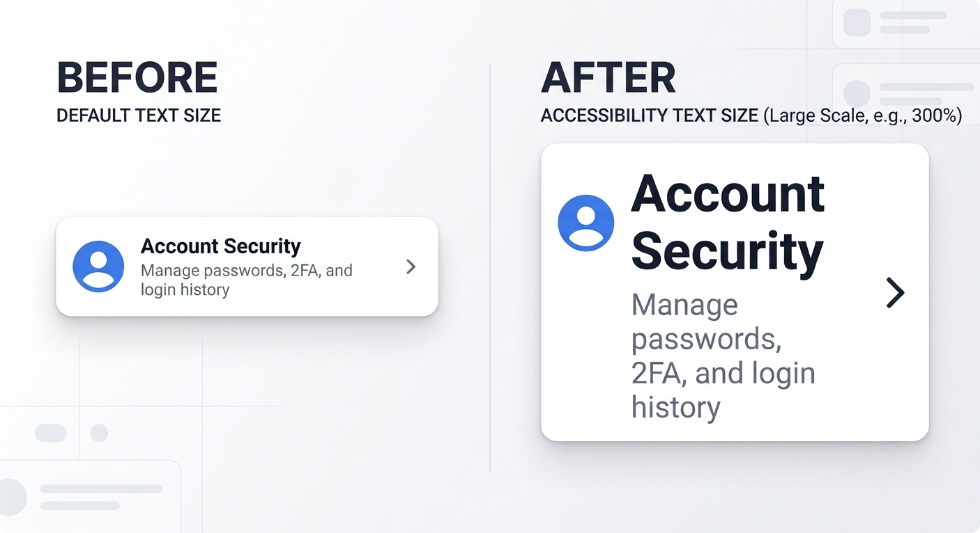
The design system had a mature typography foundation — but a fixed one. Text styles didn't respond to a customer's preferred iOS text size, so anyone who needed Dynamic Type for readability simply couldn't use it in the app. That's not a cosmetic gap in a healthcare product: customers use this interface to read health data, alerts, and treatment-related information. Harder to read means higher cognitive load, at the exact moments when clarity matters most.
The obvious fix — just let the fonts get bigger — was also the wrong one. Components had been built around fixed heights, single-line labels, and tight dimensions. Naively scaling type would have caused truncation, overlapping content, and controls too crowded to operate — trading one accessibility failure for another.
So I framed it as a system-level problem, not a typography ticket: how might we let text scale across the app while preserving readability, interaction clarity, hierarchy, and layout stability at every supported size? That framing mattered because of timing, too — the system had reached enough maturity and adoption that fixing this at the foundation was still possible. Wait longer, and every new component built on the fixed assumption would make the eventual fix more expensive.
"Dynamic Type looked like a font-size feature. It was actually asking whether the system could remain usable under pressure — not just look good in its default state."
Architecture Decisions
Audit before design. I evaluated the system's typography and high-use components against the full range of supported iOS content-size categories — not just the common increases. That surfaced the real failure patterns: fixed-height containers, single-line-dependent labels, insufficient spacing, and a typography system with no defined relationship to iOS's own semantic text styles.
Two directions rejected, on the record. Proportional font scaling was the cheapest option — just make everything bigger by the same multiplier — but testing showed it broke down at the largest accessibility sizes: labels truncated, controls crowded, layouts failed. Separate accessibility component variants gave more control per-component, but meant designing, maintaining, and documenting two versions of everything — a system built to drift apart from itself over time, and one that pushed the decision of "which version" onto every product team.
The decision: adaptive behavior as the default, not a parallel system. Design system styles were mapped to native iOS semantic text styles (title, headline, body, callout, caption) rather than scaled with a single custom multiplier — hierarchy came from the platform's own scaling logic, which customers already understood. Components then followed one shared adaptive hierarchy rather than bespoke rules per screen: expand the container → wrap content → increase height and spacing → reflow horizontal layouts to vertical → deprioritize or remove nonessential elements only if space is still constrained. Critical information and primary actions were never allowed to truncate; only nonessential content could.
Tested against the conditions that actually break systems. Long localized strings, Bold Text stacked on top of the largest Dynamic Type size, numeric values needing to stay legible when wrapped, icons losing their connection to the text they labeled, repeated list rows with variable heights — the edge cases were treated as the real test of the system, not the default screens.
Built a Dynamic Type Simulator to make that testing repeatable.
I built a Dynamic Type Simulator to make accessibility testing repeatable. Manually recreating every content-size category, Bold Text combination, and string-length scenario across 22 components was not sustainable. Instead, I created a working simulator in Figma Make that let me preview any component across the full range of accessibility text sizes on demand, without rerunning the app each time.
What had been a manual QA pass became a fast, repeatable check I could run on every new component before it shipped. The simulator also became the shared review tool for the two iOS engineers and me, allowing us to evaluate the same component behavior together rather than each relying on a different device or environment.
Building the simulator inside a design tool, rather than requesting a dedicated engineering build, meant it was available within days instead of sprints. I could refine the testing tool at the same pace that I was iterating on the components it was designed to validate.

Governance & Adoption
Design-with-engineering, not design-then-handoff. I partnered with two iOS engineers as co-owners of the outcome, not recipients of a spec: I defined intended experience and scalable rules, they evaluated platform constraints and feasibility, and we resolved edge cases together in component reviews rather than in a one-way handoff. Native iOS behavior didn't always match what Figma predicted with real content — staying embedded through implementation, not just through design, is what caught that.
Won the density argument with evidence, not opinion. Some stakeholders worried taller components and more scrolling would make the system feel less efficient. Rather than relitigating it as a preference, I showed the alternative directly: preserving compact layouts at large text sizes produced truncation and hidden information. Once the tradeoff was visible side-by-side, readability and access to critical information won as the higher priority.
Prioritized under real constraint. With one designer and two engineers, we couldn't rebuild every component at once — so the typography foundation and highest-use, highest-risk components came first, establishing reusable patterns the rest of the system could extend incrementally rather than treating each screen as its own accessibility project.
Documentation as the scaling mechanism. Specifications, test scenarios, and documented adaptive rules meant product designers and developers could apply Dynamic Type consistently without re-solving accessibility screen by screen — the same "system carries the knowledge, not the individual" principle behind your earlier design-library work, applied here to a healthcare product years later.
Measured Outcomes

What I’d Do Now
Bring in content and localization partners earlier. Long strings, translated content, and units created the most demanding layout conditions — validating against them from day one, not after the system was built, would have surfaced more real-world edge cases sooner.
Automate the accessibility test matrix. Much of this validation was manual review across text-size categories; I'd establish automated accessibility and snapshot testing with engineering from the start, so regressions surface automatically as the system evolves.
Define metrics before, not after, implementation. Dynamic Type coverage percentage, truncation-defect counts, and percentage of components on adaptive patterns should have been baselined before we shipped — you can't prove a system's value with data you didn't start collecting.
Treat this as the standard, not the exception. The deeper takeaway — a component isn't truly scalable if it only works with short English labels and default text sizes — should be a stated design principle going forward, not an implicit lesson from one project.